With the 2020-21 season up and running, clubs in the Premier League and across Europe have now given their new kits a good airing.
But, as usual, the corresponding warm-up gear have snuck under the radar, with designers taking the opportunity let their creativity run wild.
Last year we tried to shine a light on the issue in the hope that it would bring an end to the production of some truly ghastly efforts, but the struggle continues.
Prematch and warm-up kits aren’t usually worn in training sessions and don’t always hit the club shops, and so they are mainly seen by the wider public only fleetingly during the build-up on live match broadcasts.
This means that the various jerseys tend to escape without having the spotlight of sartorial judgement thrust upon them — but not on our watch.
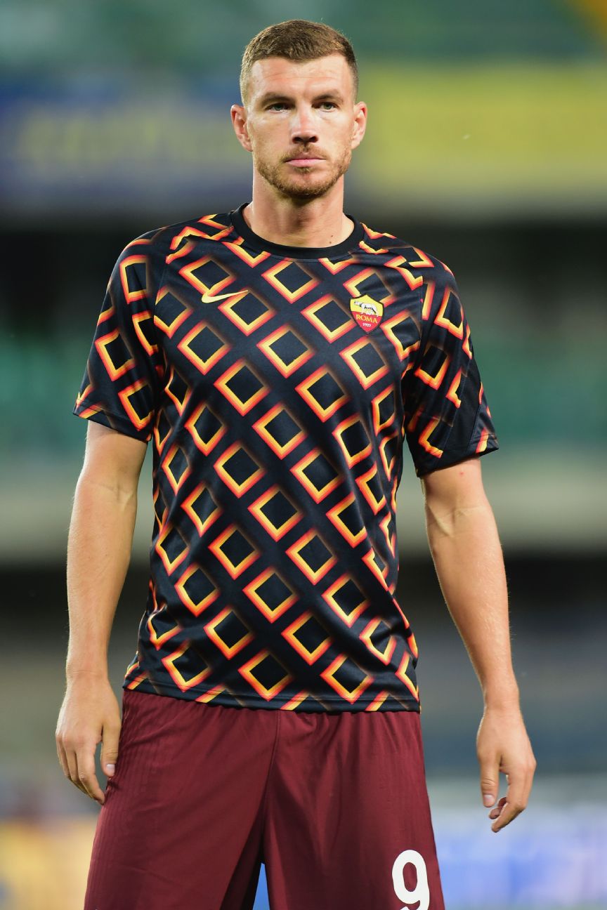
Roma’s rhombus-covered warm-up top is a tribute to the club’s “ghiacciolo” (“ice pop”) kits, which they wore from 1978-80.
However, for us it harks back to that era more because it looks so much like the carpet of the Overlook Hotel in Stanley Kubriick’s 1980 horror classic “The Shining.”

Slightly more maroon that we’ve come to expect from the Gunners, the warm-up shirt graphic is apparently “hand-brushed and disruptive” — much like a certain tousled Brazilian defender.
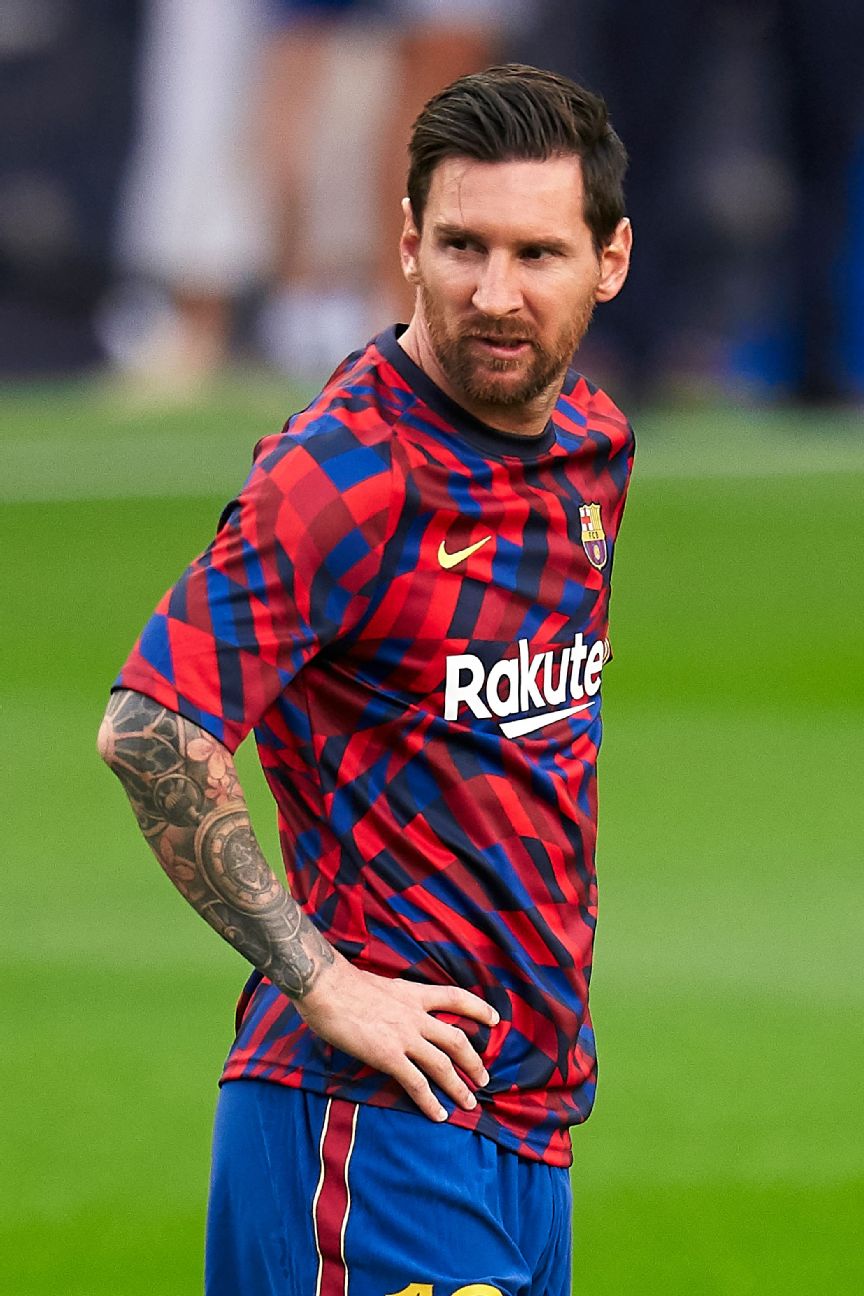
Inspired by the abstract mosaics of the great Catalan architect Gaudi, Barca’s latest warm-up jersey is definitely an eyeful. Lionel Messi look like he’s not keen, and neither are we.

You’ll start to notice a pattern emerging in Adidas’ prematch range. They’re all the same template, just with slightly different colours and the appropriate team name scrolled all the way down the shoulders and sleeves.
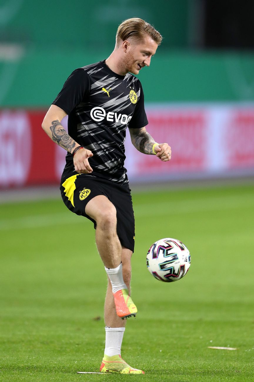
While the new home shirt is uber-bright “cyber yellow” and black, the warm-up top is a muted monochrome version of the same design and is more soothing as a result.
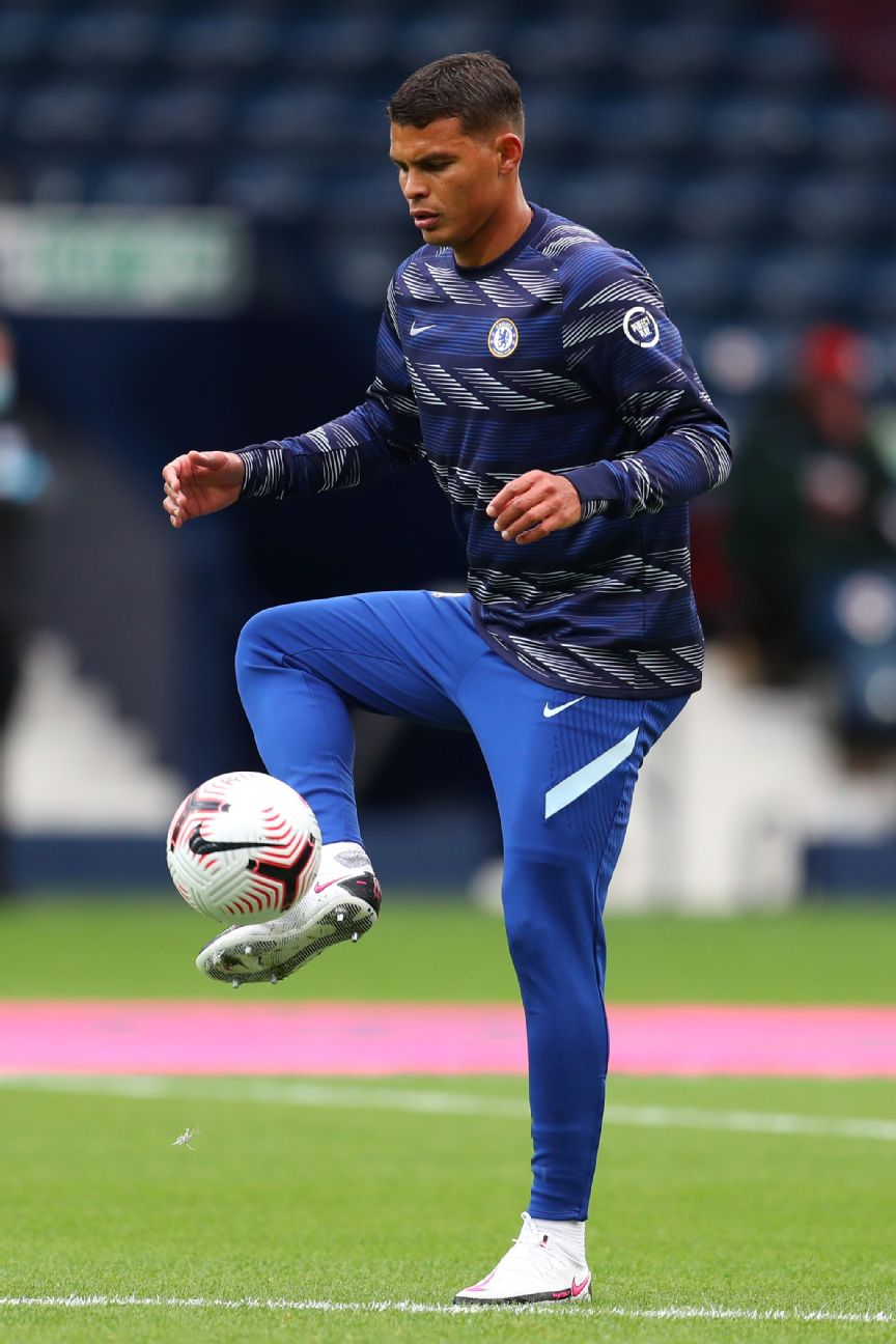
Chelsea really haven’t fared well with their kits this season — Crystal Palace were quick to flag up the similarity between their home jersey and the Blues’ third alternate — and it’s made all the worse by an ugly striped warm-up jersey.
It’s all over the place. No wonder Thiago Silva played like he was in a trance as he had a debut to forget in the chaotic 3-3 draw at West Brom.
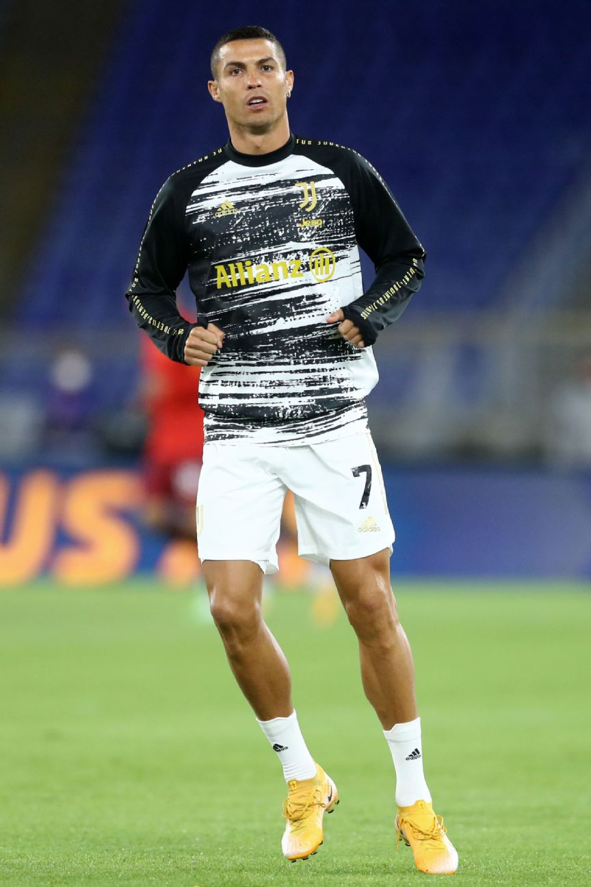
Another template offering from Adidas, although the fuzzy monochrome definitely gives Juve’s warm-up attire the look of static interference on an old television set..

Printed all over with jacquard imagery inspired by the Shankly Gates at Anfield, the Reds’ prematch shirt is all svelte and noir, like the designer luggage belonging to an international jet-setter.
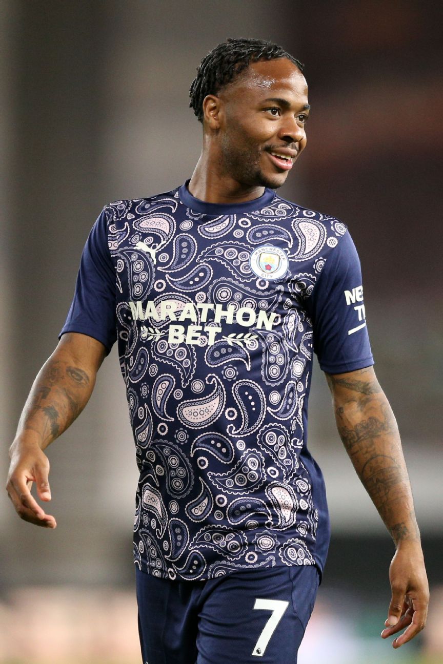
City were so pleased with their beige paisley third kit that they’ve gone and turned it all up a notch for their warm-up shirts. The result is a cluttered navy design that is liable to bring on feelings of nausea if stared at for too long.
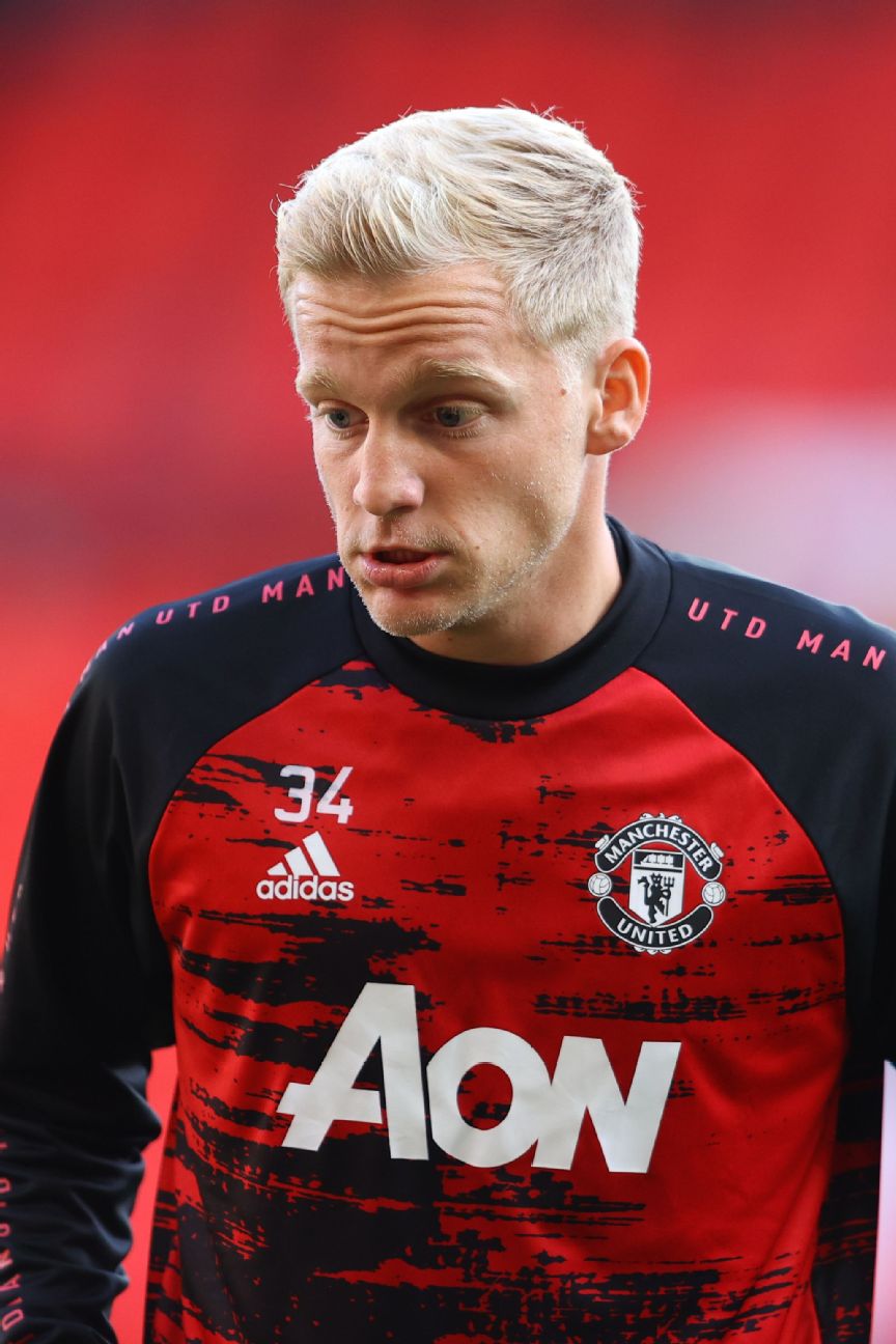
If the pattern used for the new United home shirt looks like it was nabbed directly from an old Greater Manchester bus, the corresponding warm-up jersey looks like its been run over by one.
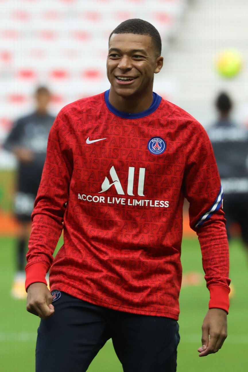
PSG have seen fit to dress Kylian Mbappe and his teammates in bright red pyjamas as they prepare for matches this season. At least they won’t forget which city they’re representing in a hurry.
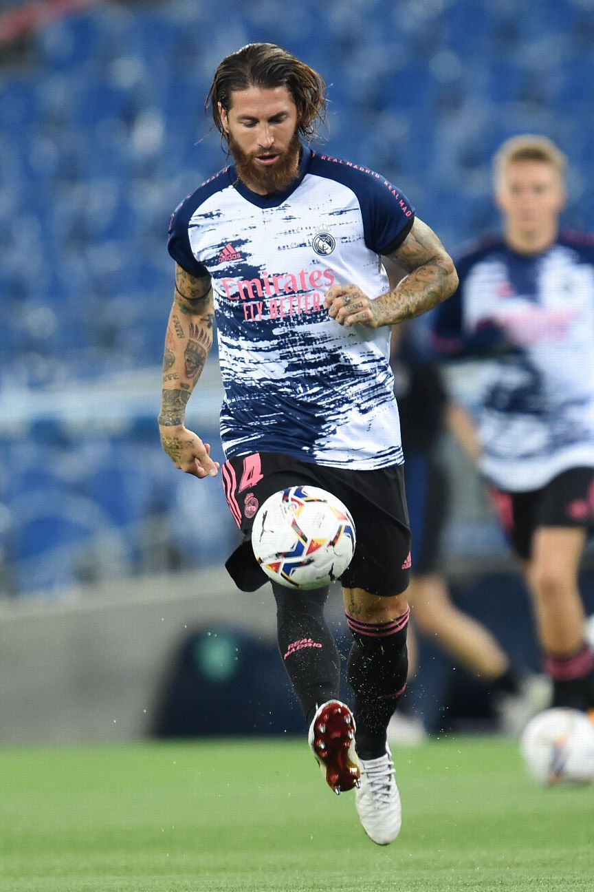
There’s a lot going on with Los Blancos‘ prematch jersey — and none of it is pleasing on the eye. It’s like someone has eked out the last few drops of blue paint with a roller on to a white wall.
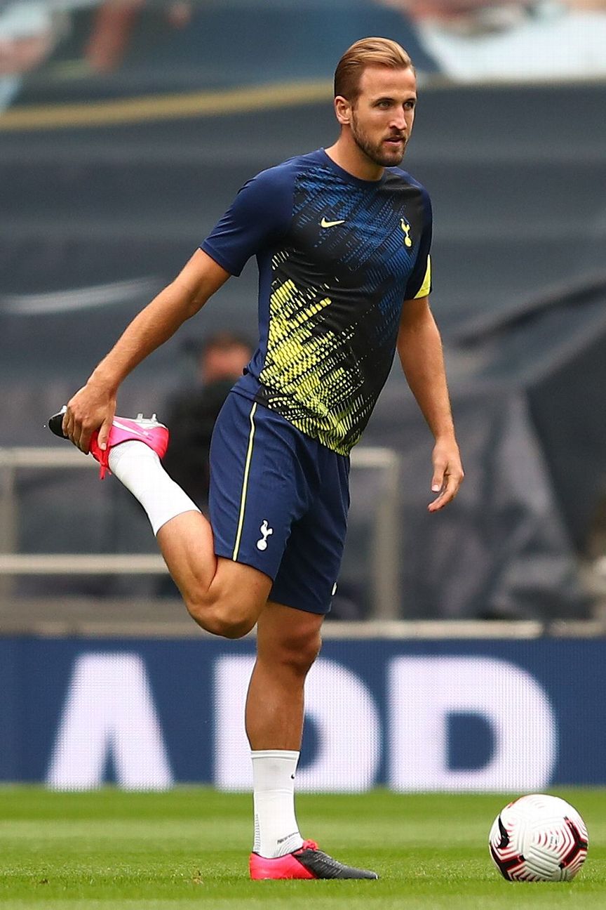
The new Spurs warm-up shirt features diagonal stripes that serve as a vague nod to their kits of the 1980s and 1990s. It’s fine, but hardly set to linger long in the memory. It’s a shame the same can’t be said for some of the others on this list.
Credit: Source link